Showing posts with label images. Show all posts

Wednesday, 15 April 2020

Easy English. Easy Read. What's it all about?

Over the last 18 months I have been presenting papers at various international and national conferences on just this issue.

The papers have been based on the research I have done looking at the visual and the linguistic differences between Easy English and Easy Read.

But first let’s dispel a myth.
Australian Easy English was originally and continues to be developed for a range of people with low or little literacy skills. It is not that this is for people with intellectual disabilities, and something else, such as Easy Read is for those one do not have an intellectual disability. If I am writing for a Disability Service, I may choose different images and some specific vocabulary compared to a project for the local Courts. However, the final look of a document, the way elements are put together and the sentence construction will be the same. Easy English is relevant to anyone in our community who needs it. At this time of stress and anxiety about COVID19 and constantly changing rules and regulations, Easy English is valuable for everyone in our community.

The development of Easy English or Easy Read is a multi-faceted and multi-layered mix of language, vocabulary, sentence structure, format, images and consumer testing. Trying to unpack each of these categories and then the many elements in these categories to determine what functionally works best can be a challenge. We need to start progressing the conversation and build awareness of the fact Easy English and Easy Read are different.

How then does this relate to the latest research that looks at comprehension of Easy Read?
You need to read the next blog to hear more about that.

First impressions are very important. So, let’s look at a visual comparison of Easy English and Easy Read. 

Research in this area explains 'white space is thinking space.' 
Having clear and delineated space between topics enhances the readers desire to engage with the material. The document needs to feel open and welcoming to its readers.

For this blog, I am taking 3 documents on the same content on COVID19.
Let's look at a page of 

1) Australian Easy English 2) Australian Easy Read and 3) UK Easy Read. All three have been published in the last 3- 4 weeks in 2020 (Late March/early April).

1.Easy English  Australia


2. Easy Read Australia

3. Easy Read UK


Element
Australian
Easy English
Australian
Easy Read
UK
Easy Read
Title
With image
No image
With image
Title in line with body of text.
Yes.
In line with text
No.
Left aligned
Yes
In line with text
Use of white (empty) space
Yes
No
Yes for text
No for images
Double line space throughout
Yes
No
No
Use of columns
No
Yes
No
Coloured images to enhance meaning
Yes
No
Yes
4-5 images per page
Yes
No
Yes
Selection of images
Symbols.
Used by people with disability
Line drawings.
New images. Stylised
Photos.
Of people with disability.
UK models

Images connected visually to the text
Yes
No
No


This table and the examples do demonstrate there are visual differences between Easy English and Easy Read. Of note, there are more similarities between UK Easy Read and Australian Easy English than the Australian Easy Read in this specific example. You would need to do a comparison across multiple documents to see the clear pattern of differences.

Why is it important to know and recognise these differences?
Content developed needs to use the best available research and evidence. It is imperative that when developing accessible content for vulnerable audiences what is developed best reflects what the research tells us, such as
 - the value of white space;
- the importance of images with headings;
- predictable places to find the text and content. i.e. always find the image on the left, and the text beside it, i.e. no use of columns.

The two Easy Read versions above, may be appropriate for some audiences. However, it still leaves a substantial percent of people without access to meaningful information. It would be far better to develop content that meets the needs of far more people in the first instance, rather than still leave the more vulnerable people in an already vulnerable group out of access to information. 
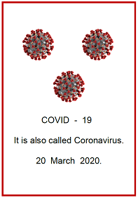
For a final thought. Compare the front pages of the 3 documents. 
A front page is something with lots of white space with connections to what you want to find out about and know. 
 
1. Easy English Australia


2. Easy Read Australia

3. Easy Read UK


Read the next blog to look at some of the language analysis similarities and differences of these 3 documents

Stay safe 
Cathy
Cathy Basterfield
Owner Access Easy English
Consultant – Speech Pathologist
Telephone: 0466 579 855

.

Using images to create meaning for COVID19


Thanks to The Workshop NZ for their blog discussion on clear and effective communication. 

posted on 2 April 2020 titled " Lifting people's gaze, a communications formula and concrete language."

They describe the importance of providing positive messages and steps for change, rather than focusing on the negative things we may be doing and using the language of blame and blame shifting.

An excerpt from
their blog

"During COVID-19 we want to enhance the interconnections we have with each other. We also need people to think about how those with the most influence can support us. People in government and employers have a significant role in helping us cope with staying at home and being mentally well. Our communications should focus there. 

We call this lifting people's gaze away from individual behaviour and choice and up to the systems and structures that have a much more powerful influence on shaping our lives and those behaviours. It is a kinder, more effective way to encourage the actions we want during times of fear and anxiety."

In just the same way, Easy English prefers to include information on what 'to do.'
Eg: You must stay at home.
Lots of things are closed. Like XXXXXX

The Workshop blog goes on to explain it is important to include concrete information.


From their blog again
“ HERE ARE SOME EXAMPLES OF HOW TO MAKE YOUR LANGUAGE ABOUT COVID-19 MORE CONCRETE
Try staying at home instead of self-isolating.
Try stay within two kilometres of home instead of stay local.
Try contact tracing officers, researchers, and analysts instead of public health workers (most people don't know about public health workers and think healthcare starts and ends with doctors and nurses).
Try keeping  two metres between us instead of physical distance or bubble.

A great example of being very concrete on physical distance:’


It is great to see The Workshop illustrating this last point with one of Access Easy English' posters on COVID19. It is critical that all images selected are as clear and concrete for Easy English content. And it must be all through the document.
You could spend lots of time working out the language elements. Selecting clear and concrete images to support the messages is as critical to making your Easy English document accessible.

Learn more about choosing images when you come to my training.
Currently I am advertising the first online 2 day Easy English training. Face to face training is still being advertised in Sydney and Melbourne at the moment. However, I am not sure they will go ahead with the current restrictions. As soon as travel restrictions are lifted more face to face in other cities will be advertised.

Keep up to date with the evidence based quality Easy English COVID19 resources and training opportunities via my social media or email me and I will add you to my mailing list.

Stay safe

Cathy
Cathy Basterfield
Owner Access Easy English
Consultant – Speech Pathologist
Telephone: 0466 579 855

LinkedIn: Cathy Basterfield
Blog: http://accesseasyenglish.blogspot.com.au
Twitter: @accesseasyengli


Thursday, 29 January 2015

Free images and image storer


Welcome to 2015.

Check out this free download of Picto- selector. Stored on it are many of the free image sets I have mentioned previously, including Sclera, Mulberry St, and others.  Here they are all in one place.  They  are easy to locate and compare with each other.  It has been developed in Scandinavia, and  is available in many different languages if you need them.   The website says The download contains over 28000 pictos (images) translated to English, Dutch, German, French, Danish, Spanish, Brazilian and Italian. (Some pictos are also translated to Arabic, Swedish, Portuguese and Indonesian).”   It can be used by multiple users.

This image storage selector can help you locate all your images of similar meanings, eg: type in "happy, and a range of different images from the various sets of this concept are available, If you have Boardmaker also, you can import these new images you regularly use, into the one storage system.

The image selector will also find words that have another word in it, eg: law, showed me a range of images for "law ", but also "lawn mower," "lawn" etc.

You can modify the images but this is limited. However, a couple of  good functions are
-  remove the border;
- remove the word from underneath the image or change the word (and/or place it in a different place as part of the image);
- have access to search function in a different language;
- easily add "no good" (red cross) good/right (green tick) over an image.

You could use this free download as a beginning point of images, or if you have a range of other image sets, use as possible alternatives.  

You can also upload photos you use regularly into Picto- selector. This is particularly useful when you cannot access Boardmaker or other image storage/selector systems.

When uploading the Picto-selector, check the copyright usage, although it does have creative commons copyright, it also asks you to acknowledge the source of your images.

Let me know your thoughts about this image storer, and the extra images you can use.

Cathy
Cathy Basterfield
Access Easy English
0466 579 855

Thursday, 3 July 2014

Free download of resources

Books without Words regularly have at least one of their resources at 1/2 price to purchase.  This month it is “Going to the doctor” and “Going to Out-patients.”
http://booksbeyondwords.co.uk/news/books-month
This is a great way to build up your resource library from this organisation.  Remember though this is UK based resources, so some images or messages may not be accurate for an Australian audience.  However, you could add an Australian image, where needed, to your conversation with the person using the books.

 There are also many of their resources available at 5 pounds each for ipad or kindle. http://booksbeyondwords.co.uk/bookshop

In addition a number of their resources are available for free download. http://booksbeyondwords.co.uk/resources
Print these off in color and have them bound properly - they are great resources for many people.  Remember many people with low literacy prefer a hard copy to looking at screens.

Currently in the free download section, there are some titles which have no language, or a few words. Some have longer statements.  Use as a basis for making it work for your audience.
Check out the titles
- “How to look after my balls.”
- “Having a colonoscopy.”

Talk to Cathy about modifying your health literature for people with low literacy.

Cathy

Cathy Basterfield
www.accesseasyenglish.com.au
cathy@accesseasyenglish.com.au

0466 579 855