Over the last 18 months I have been presenting papers at various
international and national conferences on just this issue.
The papers have been based on the research I have done looking at
the visual and the linguistic differences between Easy English and Easy Read.
But first let’s dispel a myth.
Australian Easy English was originally and continues to be
developed for a range of people with low or little literacy skills. It is not
that this is for people with intellectual disabilities, and something else,
such as Easy Read is for those one do not have an intellectual disability. If I
am writing for a Disability Service, I may choose different images and some
specific vocabulary compared to a project for the local Courts. However, the
final look of a document, the way elements are put together and the sentence
construction will be the same. Easy English is relevant to anyone in our community
who needs it. At this time of stress and anxiety about COVID19 and constantly changing
rules and regulations, Easy English is valuable for everyone in our community.
The development of Easy English or Easy Read is a multi-faceted
and multi-layered mix of language, vocabulary, sentence structure, format,
images and consumer testing. Trying to unpack each of these categories and then
the many elements in these categories to determine what functionally works best
can be a challenge. We need to start progressing the conversation and build
awareness of the fact Easy English and Easy Read are different.
How then does this relate to the latest research that looks at
comprehension of Easy Read?
You need to read the next blog to hear more about that.
First impressions are very important. So, let’s look at a visual
comparison of Easy English and Easy Read.
Research in this area explains 'white space is thinking
space.'
Having clear and delineated space between topics enhances the
readers desire to engage with the material. The document needs to feel open and
welcoming to its readers.
For this blog, I am taking 3 documents on the same content on
COVID19.
Let's look at a page of
1) Australian Easy English 2) Australian Easy Read and 3) UK Easy
Read. All three have been published in the last 3- 4 weeks in 2020 (Late
March/early April).
 |
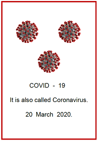
| 1.Easy English Australia |
 |
| 2. Easy Read Australia |
 |
| 3. Easy Read UK |
Element
|
Australian
Easy English
|
Australian
Easy Read
|
UK
Easy Read
|
Title
|
With image
|
No image
|
With image
|
Title in line with body of
text.
|
Yes.
In line with text
|
No.
Left aligned
|
Yes
In line with text
|
Use of white (empty) space
|
Yes
|
No
|
Yes for text
No for images
|
Double line space throughout
|
Yes
|
No
|
No
|
Use of columns
|
No
|
Yes
|
No
|
Coloured images to enhance
meaning
|
Yes
|
No
|
Yes
|
4-5 images per page
|
Yes
|
No
|
Yes
|
Selection of images
|
Symbols.
Used by people with disability
|
Line drawings.
New images. Stylised
|
Photos.
Of people with disability.
UK models
|
Images connected visually
to the text
|
Yes
|
No
|
No
|
This table and the examples do
demonstrate there are visual differences between Easy English and Easy Read. Of
note, there are more similarities between UK Easy Read and Australian Easy
English than the Australian Easy Read in this specific example. You would need to do a comparison across multiple documents to see the clear pattern of differences.
Why is it important to know and
recognise these differences?
Content developed needs to use the best
available research and evidence. It is imperative that when developing
accessible content for vulnerable audiences what is developed best reflects
what the research tells us, such as
- the value of white space;
- the importance of images with
headings;
- predictable places to find the text
and content. i.e. always find the image on the left, and the text beside it,
i.e. no use of columns.
The two Easy Read versions above, may
be appropriate for some audiences. However, it still leaves a substantial
percent of people without access to meaningful information. It would be far
better to develop content that meets the needs of far more people in the first
instance, rather than still leave the more vulnerable people in an already
vulnerable group out of access to information.
 |
| 1. Easy English Australia |
 |
| 2. Easy Read Australia |
 |
| 3. Easy Read UK |
Read the next blog to look at some of
the language analysis similarities and differences of these 3 documents
Stay safe
Cathy
Cathy Basterfield
Owner Access Easy English
Consultant – Speech Pathologist
Owner Access Easy English
Consultant – Speech Pathologist
Telephone: 0466 579 855
Email: cathy@accesseasyenglish.com.au
Website: https://accesseasyenglish.com.au/
Facebook: https://www.facebook.com/accesseasyenglish
Blog: http://accesseasyenglish.blogspot.com.au
Twitter: @accesseasyengli
Blog: http://accesseasyenglish.blogspot.com.au
Twitter: @accesseasyengli
.
Thanks Carly
ReplyDelete