In the last blog I talked about the importance of the first impression.
Your first impression is the visual impression.
Irrespective of whether you creating a poster or document or brochure
some other things are just as important.
- Consistency
- where are the images consistently?
- Predictability
- where do I go next/what do I read next?
- What
is the topic? Should this content be in more than 1 poster or brochure or
document. Mostly for Easy English this is a definite yes.
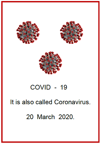
Let's look at 2 posters created for COVID19 recently.
1) Developed by Australian Easy English Writer
2) UK developed Easy Read for an Australian audience.
 |
| Australian Easy English |
 |
| Australian Easy English |
 |
| UK developed Australian content Easy Read |
Element
|
Australian
Easy English
|
UK
Easy Read
|
Title
|
With image
|
Multiple images left and right of
image
|
Placement of images
|
Title on left of text.
Body, consistently on top of text
|
Title – left and right of text.
Body of text - Most on
left, but also on Right and above text
|
Use of white (empty) space
|
Yes
|
No
|
Double line space throughout
|
Yes
|
No
|
Images per page
|
6
|
12
|
Space for each image
|
Yes
|
No. Often overlap
|
Selection of images
|
Symbols.
Used by people with disability
|
Photos.
Of people with disability.
UK models
|
Use of columns
|
Yes – minimum text and image
|
Yes – columns filled with text and
images. One or two words per column width.
|
Use of
-
Bold
-
Sentence
case
-
Italics
|
Yes – heading
Yes
No
|
Yes - heading and body of text
No. eg: DO NOT; CALL
Yes eg: CALL
|
Repetition
|
No
|
Yes – telephone number
|
Standard format for phone numbers
|
N/A
|
No
|
Topic
|
1 per poster
|
Multiple topics
|
Even with this small comparison there are significant differences in the 2 types of posters. This has an impact for our readers with more limited literacy. Visually the reader needs to ask where do I start: where do I go: which bit is important: what is the green triangle for?
Formatting such as sentence case only and no italics has been identified as 2 elements which all readers need. Why then should a document that has an intended audience of people with lower literary have these elements in their document?
Some language
differences.
Although only a small sample, the differences in these posters reflect what I discovered in the larger language analysis completed using 5 documents in Easy English and 5 documents in Easy Read, rather than single page posters.
Element
|
Australian
Easy English
Poster L Poster R
|
UK
Easy Read
|
Number of words
|
13 26
|
58
|
Use of grammatical markers, eg ing, ly, plural
|
1 -plural 2 - plural
|
6
– ing – 2
- ly – 1
- ed – 1
- plural - 3
|
Sentence length
|
1 sentence; 1 sentence;
Of 4 words Of 4 words
|
7 sentences;
Ave 8.2 words long
|
Phrases
|
4 phrases. 6 phrases
Ave 2 word Ave 3.5
long words long
|
0
|
If …then statements
|
0 0
|
1
|
Use of conjunctions
Eg: ‘and‘ ‘or’
|
0 0
|
3
|
Use of contractions eg: won’t
|
0 0
|
2
|
Everyday word use
COVID-19 or Coronavirus
|
COVID-19 (1) COVID-19 (1)
|
Coronavirus (2)
|
Element
|
Australian
Easy English
Poster L Poster
R
|
UK
Easy Read
|
Words with more than 1 syllable
|
2 5
2 syll – 1 2 syll - 5
3 syll - 1
|
11
2 syll – 8
3 syll –
4 syll –1
5 syll - 2
|
Percent of total words
|
15% 17%
|
18%
|
Number of words with more than 3
syllables
|
0 0
|
3 = 5%
|
These findings are typical for all the comparative data I have collected between Easy English and Easy Read content. Keeping in mind that if someone has difficulty saying a word, they are less likely to understand the word and use it themselves. Additionally they are less able to make the connection with that word written down. In my typical consumer reviews, consumers have difficulty saying most words over 2 syllables in length. They rarely use them, and rarely know what they mean.
All this analysis is critical to know about and be
aware of as you construct your accessible content to provide best practice accessible,
functional and meaningful information for everyone.
Let's agree that Easy English and Easy
Read are different. Individually you may have a consumer who can manage more
complex information. However, if that is all you develop for everyone you are
leaving a substantial and very vulnerable cohort of people out of the circle of
information.
Happy to talk with you about other data
I have collected, and the impact on developing effective Easy English or book
into my training. Learn more about how you can write effective and best
practice Easy English. Details on my home page
Easy English resources
Poster. Look for the
signs https://bit.ly/3944NrJ
Poster. Look after your
self. https://bit.ly/2WxSl0L
Visit https://accesseasyenglish.com.au/covid-19-resources/ for
all the Easy English resources
Stay safe, Cathy
Cathy Basterfield
Owner Access Easy English
Consultant – Speech Pathologist
Owner Access Easy English
Consultant – Speech Pathologist
Telephone: 0466 579 855
Email: cathy@accesseasyenglish.com.au
Website: https://accesseasyenglish.com.au/
Facebook: https://www.facebook.com/accesseasyenglish
Blog: http://accesseasyenglish.blogspot.com.au
Twitter: @accesseasyengli
Blog: http://accesseasyenglish.blogspot.com.au
Twitter: @accesseasyengli